Bluda Hair & Nails
Vitamin gummies for hair and nails, for the Latin American community in Spain: product, routine and texture in a pink and berry palette, plus a carousel with five habits for stronger hair.

Feeds planned as a whole: every post works alone and the grid reads as one brand when someone lands on the profile.
Vitamin gummies for hair and nails, for the Latin American community in Spain: product, routine and texture in a pink and berry palette, plus a carousel with five habits for stronger hair.
Content for an architecture studio: black-and-white architecture crossed by the brand’s blue brushstroke, and short, playful videos for the feed.

The feed of an audiovisual production company from São José dos Campos: portraits, behind the scenes and work for brands, held together by black and white and warm, natural tones.

The feed of an architecture and interiors studio: facade studies, the “Diário de Obra” series, design objects and editorial portraits in a quiet palette of stone, cream and brown.

Golf as a metaphor for planning and achievement: a feed in deep green and gold that moves from the course to the clubhouse, with the brand on flags, balls, clubs and polos.


Sun, salt, skin and culture as a feed: beach, night, texture and product in the same warm, sensual mood.

Product videos and campaign short films, from the first idea to the final cut.
A diamond ring against deep blue: macro shots of the engraved band and the pavé catching the light, then the ring on the hand, close to the face.
The running shoe above the clouds: runners, a paraglider and the white Cloudsurfer floating in the sky, edited for feed and stories.
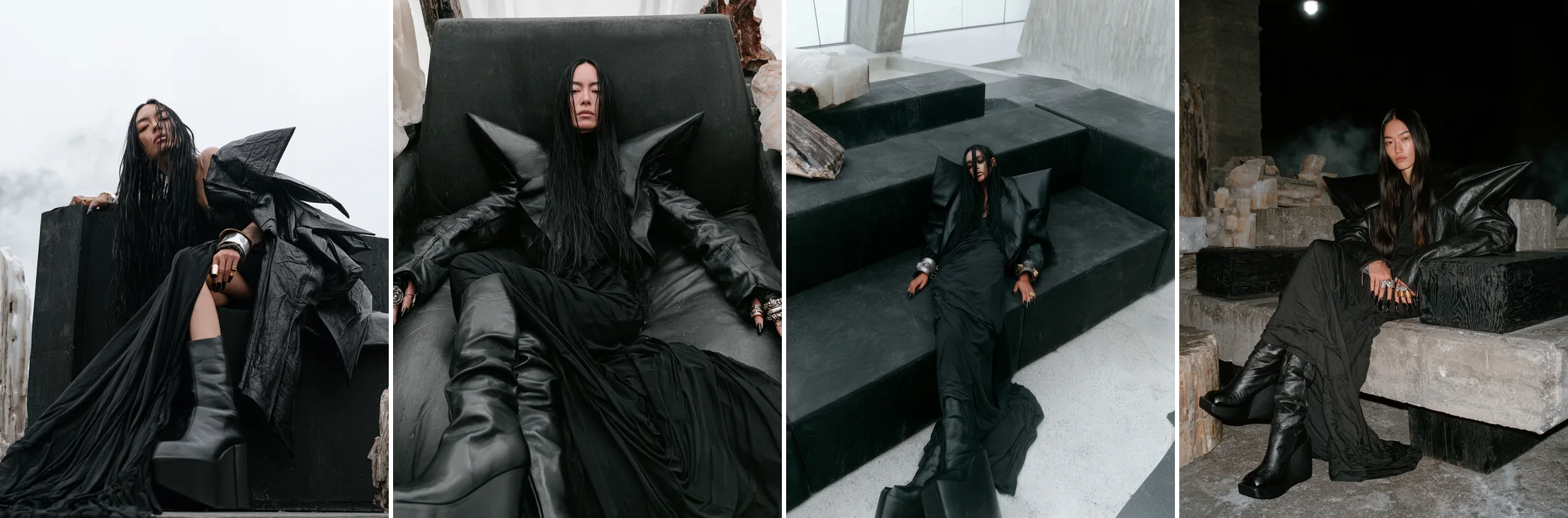
A dark, ritual-like campaign with stills and a short film.
A campaign short film about three generations of women and the woven bag passed from one to the next: the house, the hands, the legacy.
The Boston bag in a film and a photoshoot that work together as one campaign: the leather being cut, the bag taking shape on the workbench and the monogram up close.

The Violette 30 eau de parfum among dark violet petals, soft linen and wisps of smoke: a slow, sensorial film about the scent before it is worn.
Logo, typography, color and the visual rules that make a brand recognizable everywhere, from the packaging to the feed.
A resortwear brand built around sun, salt, skin and culture, between Rio, Ibiza and Bali. The identity covers the logo, a material language, the store, packaging and the online shop.


LogotypeA light, high-contrast serif with long, fine strokes.
SupportA widely tracked sans for labels, navigation and details.


Vitamin gummies for hair and nails: a soft lowercase wordmark, line icons for hair and nails, and a wine and berry palette that carries from the jar to the feed.


WordmarkA soft, rounded geometric sans, always in lowercase.
SupportA clean grotesque for headlines and social copy.

An identity built on the codes of golf and the clubhouse: a classic serif wordmark, deep greens and old gold, leather and tweed textures, applied from the flag on the course to the website.


WordmarkA classic serif in capitals, with the tagline in lowercase between fine rules.
SupportA clean sans in spaced capitals for navigation, labels and buttons.


A social club in Barcelona born from a family story of mountains, sport and freedom. The mark splits a peak and an ice crystal down the middle, and the identity runs from the logo and packaging to the floor plan and the interiors of the space.
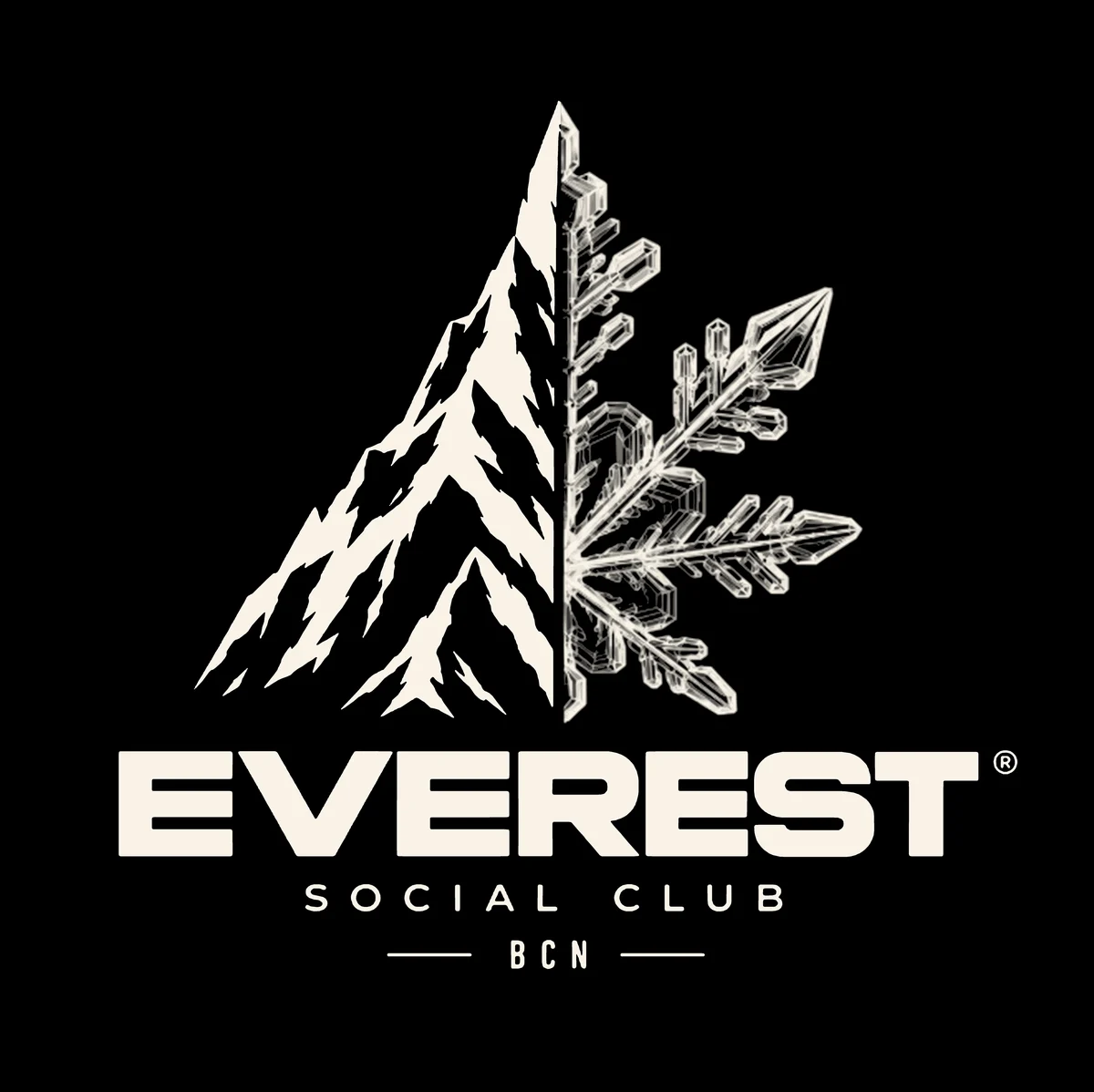
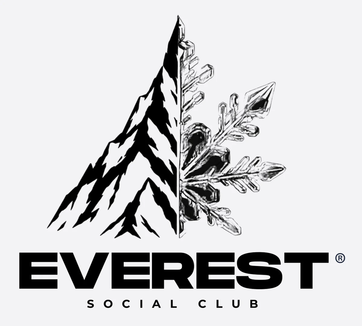


WordmarkA wide, heavy sans in capitals, with the name of the club spaced out below.
SupportHelvetica Neue in bold, medium and regular, set in spaced capitals for labels and short lines.


DaheroomStudio
The client room. Enter the access code from your invitation to find your package.